Project Three Part Two
Description:
Create a series of compositions with placeholder text. Use the grid
to determine the potential placement of a graphic/image and
text. Create dynamically divergent compositions. Use any type
variety within the Univers family. Use size and scale change to
your advantage.
Project Requirements:
- Each series of compositions will start with a 10″ x 10″
composition in InDesign.
- Each set of compositions will exclusively use the type family LT–Adobe Univers
- You must also specify type, which appears to represent three (3) layers of hierarchy.
- Use placeholder text unless you wish to add “content” to
a large display type where you copy edit your own text.
- Page Division: seven (7) rows and seven (7) columns.
Create 1o compositions using the following page criteria:
Page/Document Requirements:
- Document Size: 10″ x 10″
- Non facing pages: ~
- Number of pages: 10
- Create an equal number of guides (H/V) dividing the page; 7/7, 6/6, 10/10 Start with 7 columns, 7 rows.
- Base the columns and rows according to the page .125″ gutter.
- NO page margins
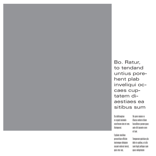
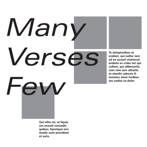
Use modules to produce organizational hierarchy compositions between place holder text, set accordingly; box(s) indicating photo(s) placement {use a tinted boxes to indicate photo placement; 50% blue/grey} 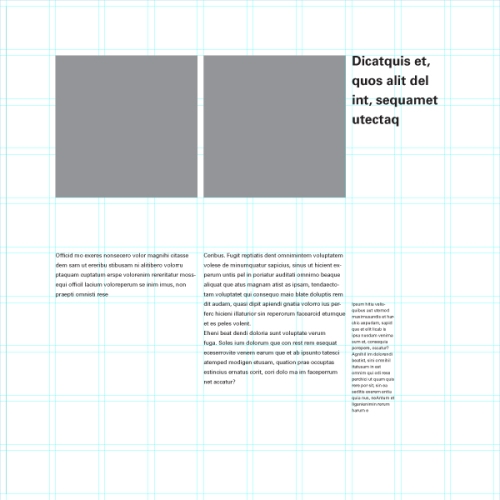

Objectives:
- Examine the diversity and versatility of a series of grid structures
- Examine subtle hierarchy possibilities in relation to three congruent sets of text
- Look at the possible compositions of text and image, examine:
- Size relationship
- Contrast
- Pattern
- Texture
- Single vs. multiple
- Large vs. Small
- Consider the totality of the composition when text and image are aligned to a grid
Create a PDF file with a full collection of your compositions
::
Definitions
Grid — def.
A grid is a network of lines. It is a tool for generating form, arranging images, and organizing, information. The grid can work quietly in the background, or it can assert itself as an active element. The grid becomes visible as objects come into alignment with it. Some designers use grids in a strict, absolute way, while others see them as a starting point in an evolving process.
In the design of printed matter, guidelines help the designer align elements in relation to each other. Consistent margins and columns create an underlying structure that unifies a document and makes the layout process more efficient.
A well-made grid encourages the designer to vary the scale and placement of elements without relying wholly on arbitrary judgements. The grid offers a rationale and a starting point for each composition, converting a blank area into a structured field.
Grids are part of modern urbanism and architecture. The facades of many glass high rises and other modern buildings consist of uniform ribbons of metal and glass that wrap the building’s volume in a continuous skin. The street grids used in many modern cities around the globe promote circulation among neighborhoods and the flow of traffic, in contrast with the suburban cul-de-sac, a dead-end road that keeps neighborhoods closed off and private.
The grid imparts a similarly democratic character to the printed page. By making space into numerous equal units, the grid makes the entire page available for use; the edges become as important as the center. Grids help designers create active, asymmetrical compositions in place of static, centered ones. By breaking down space into smaller units, grids encourage designers to leave some areas open rather than filling up the whole page.
Hierarchy — def.
Hierarchy is the order of importance within a social group (such as the regiments of an army) or in a body of text (such as the sections and subsections of a book). Hierarchical order exists in nearly everything we know, including the family unit, the workplace, politics, and religion. Indeed, the ranking of order defines who we are as a culture.
Hierarchy is expressed through naming systems: general, colonel, corporal, private, and so on. Hierarchy is also conveyed visually, through variations in scale, value, color, spacing, placement, and other signals.
Like fashion, graphic design cycles through periods of structure and chaos, ornament and austerity. A designer’s approach to visual hierarchy reflects his or her personal style, methodology, and training as well as the zeitgeist of the period. Hierarchy can be simple or complex, rigorous or loose, flat or highly articulated. Regardless of approach, hierarchy employs clear marks of separation to signal a change from one level to another. As in music, the ability to articulate variation in tone, pitch, and melody in design requires careful delineation.
In interaction design, menus,texts, and images can be given visual order through placement and consistent styling, but the user often controls the order in which information is accessed. Unlike a linear book, interactive spaces feature multiple links ans navigation options. Cascading Style Sheets (CSS) articulate the structure of a document separately from its presentation so that information can be automatically reconfigured for different output devices, from desktop computer screens to mobile phones, PDAs, kiosks, and more. A different visual hierarchy might be used in each instance.
The average computer desktop supports a complex hierarchy of icons, applications, folders, menus, images, and palettes–empowering users, as never before, to arrange, access, edit, and order vast amounts of information–all managed through a flexible hierarchy controlled and customized by the user.
As technology allows ever greater access to information, the ability of the designer to distill and make sense of the data glut gains increasing value.
Rhythm & Balance — def.
Balance is a fundamental human condition: we require physical balance to stand upright and walk; we seek balance among the many facets of our personal and professional lives; the world struggles for balance of power.
In design, balance anchors and activates elements in space. Relationships among elements on the page or screen remind us of physical relationships. Visual balance occurs when the weight of one or more things is distributed evenly or proportionately in space. Like arranging furniture in a room, we move components around until the balance of form and space feels right. Large objects are a counterpoint to smaller ones; dark objects to lighter ones.
A symmetrical design is inherently stable. Yet balance need not be static. A tightrope walker achieves balance while traversing a precarious line in space, continually shifting her weight while staying in motion.
Designers employ contrasting size, texture, value, color, and shape to offset or emphasize the weight of an object and achieve the acrobat’s dynamic sense of balance.
Rhythm is a strong, regular, repeated pattern: the beating of drums, the patter of rain, the falling of footsteps. Speech, music, and dance all employ rhythm to express form over time. Designers use rhythm to construct single images as well as to create books, magazines, and motion graphics that have duration and sequence. Designers seek rhythms that are punctuated with change and variation.
Graphic Design The New Basics – grid
Graphic Design The New Basics – hierarchy
Graphic Design The New Basics – rhythm + balance
::
Text acquired from: Design Observer web log and visual archive.

 Sample: Facing-pages designed as ‘spreads’


 Graphic Design Education